

TL;DR: Cookie Banner → Design tab → Customize theme, colors, buttons, and borders. Changes appear instantly in the live preview.
Overview
The banner design controls all visual styling for your consent banner. You can choose from built-in themes, customize colors for every element, and style each button individually to match your brand.
Before You Begin
Make sure you have:
Selected your consent template (GDPR or US State Laws)
Time required: About 5-10 minutes
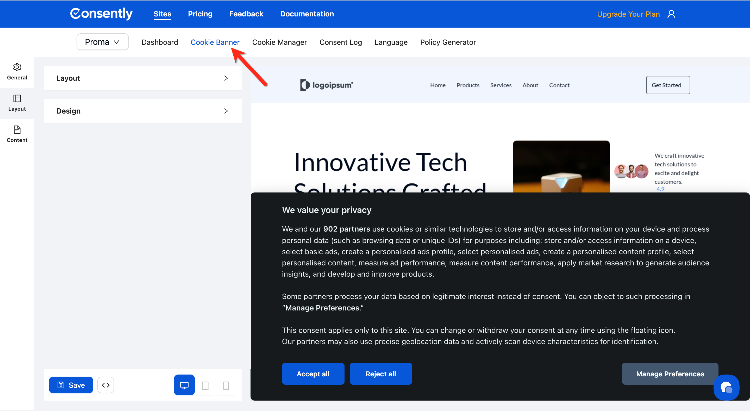
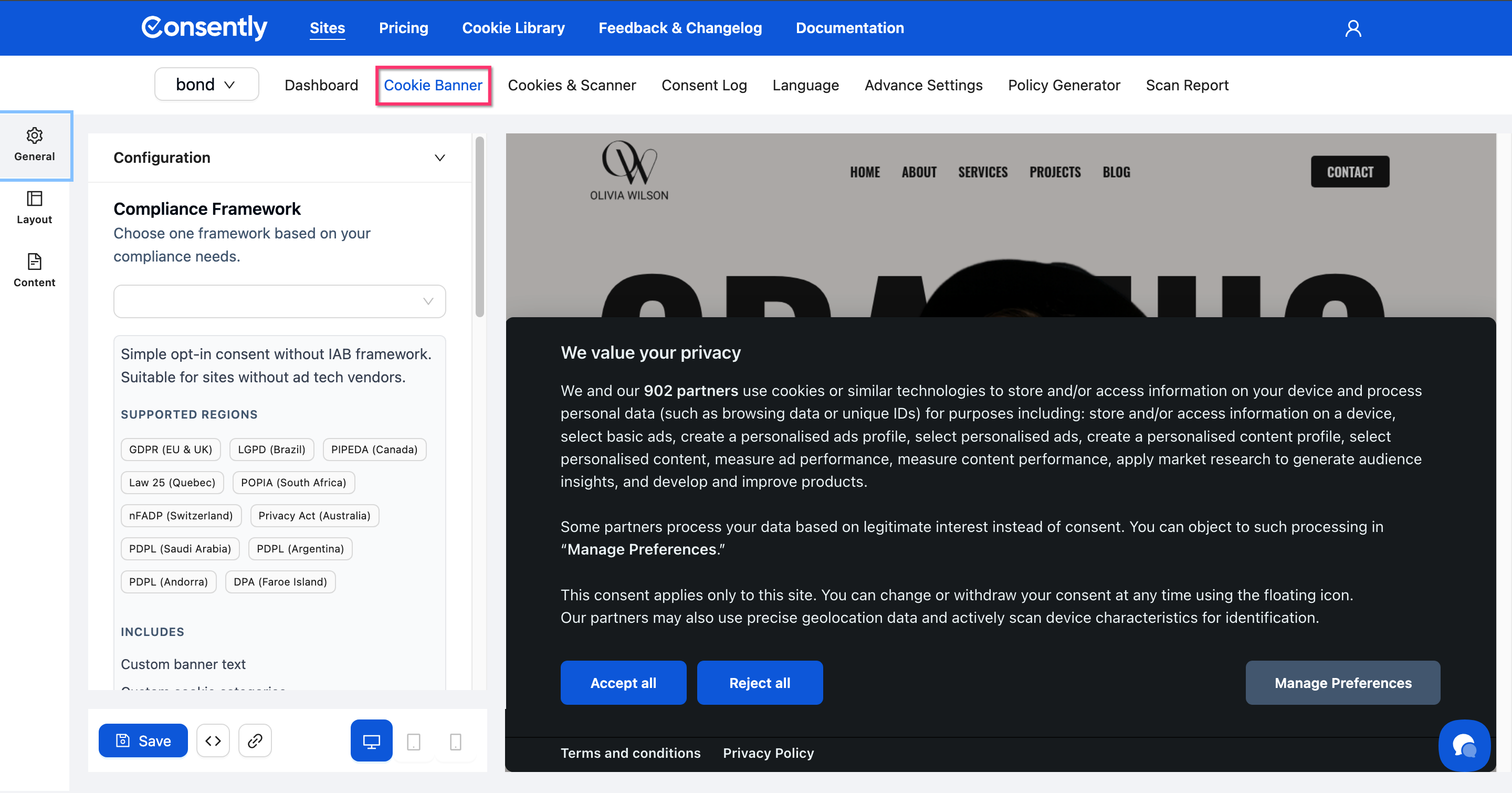
How to Access Design Settings
Step 1: Open Cookie Banner settings
Navigate to Cookie Banner from the top navigation menu.
Step 2: Open the Design section
Click the Design accordion in the left sidebar from the General tab to expand all styling options.
Choosing a Theme
Step 1: Select a theme style
Choose from three theme options:
Light — White backgrounds with dark text
Dark — Dark backgrounds with light text
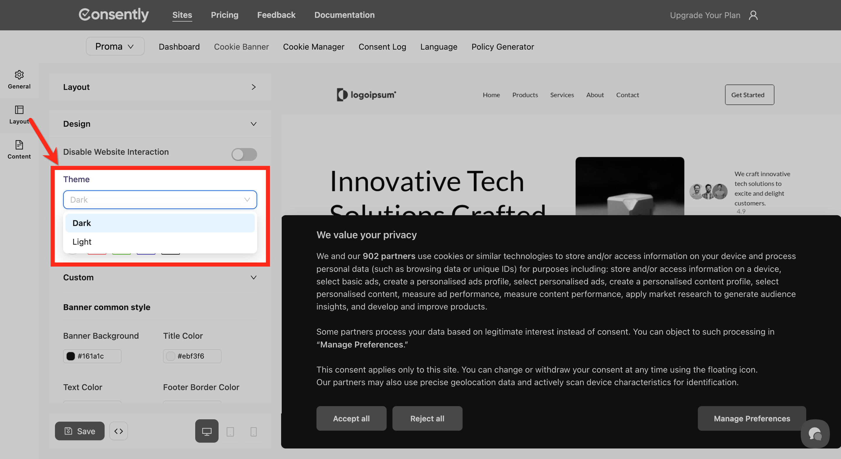
Step 2: Pick a built-in theme color preset (optional)
Select from five built-in theme color presets: Default Theme, Theme 1(red), Theme 2(green), Theme 3(blue), Theme 4(Black). Each preset applies coordinated colors across all banner elements.
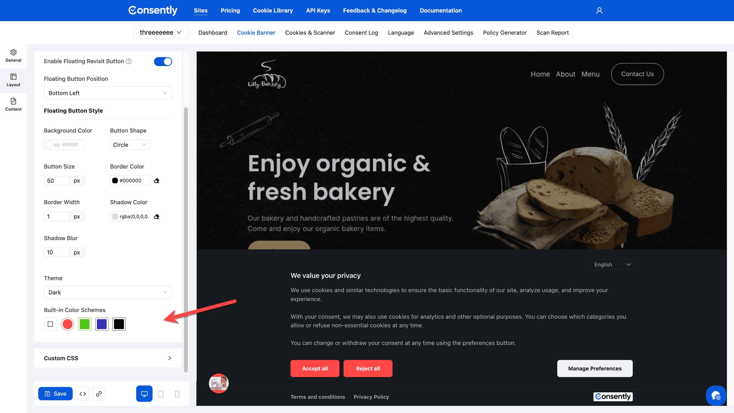
💡 Tip: Built-in themes provide quick, professional styling. Start with a preset, then customize individual elements as needed.
Customizing Banner Common Style
Customizing the Banner common Style will appear while you choose the Default Theme option from the Built-in Themes.
Background and borders
Click the color picker next to each option to adjust:
Banner Background — Main banner container color
Title Color — Consent notice title text
Text Color — Body text throughout the banner
Footer Border Color — Divider line in the preference center
Separator Color — Lines between sections
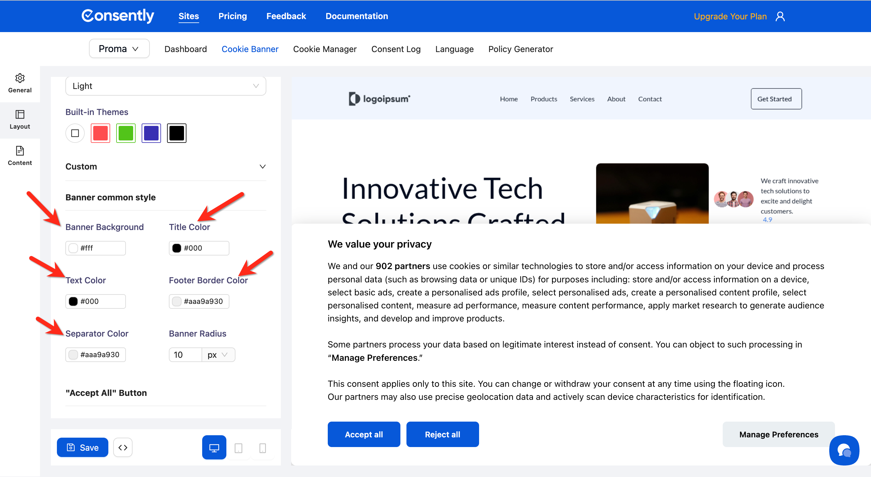
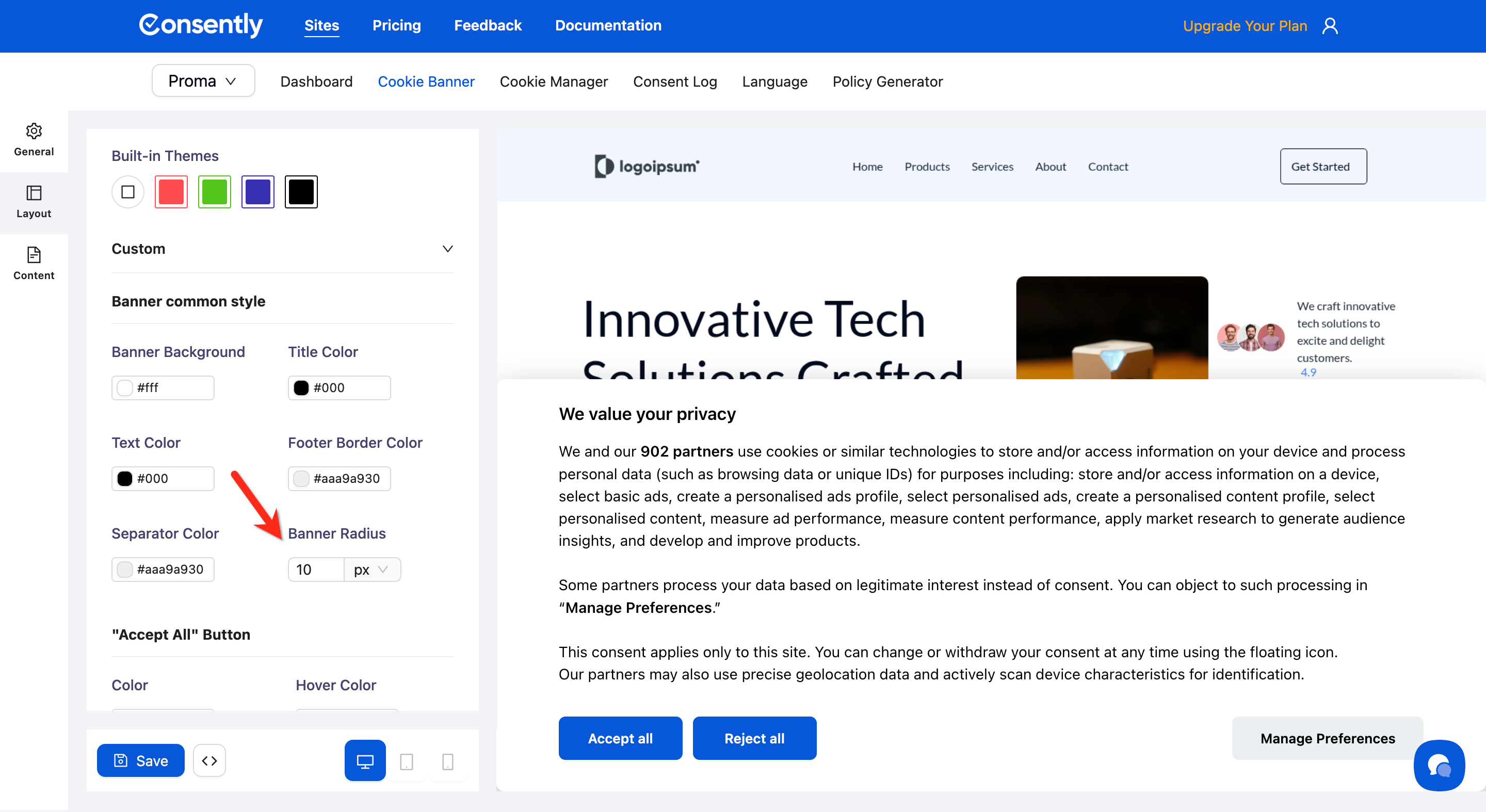
Banner radius
Enter a pixel value to control corner rounding. Higher values create more rounded corners.
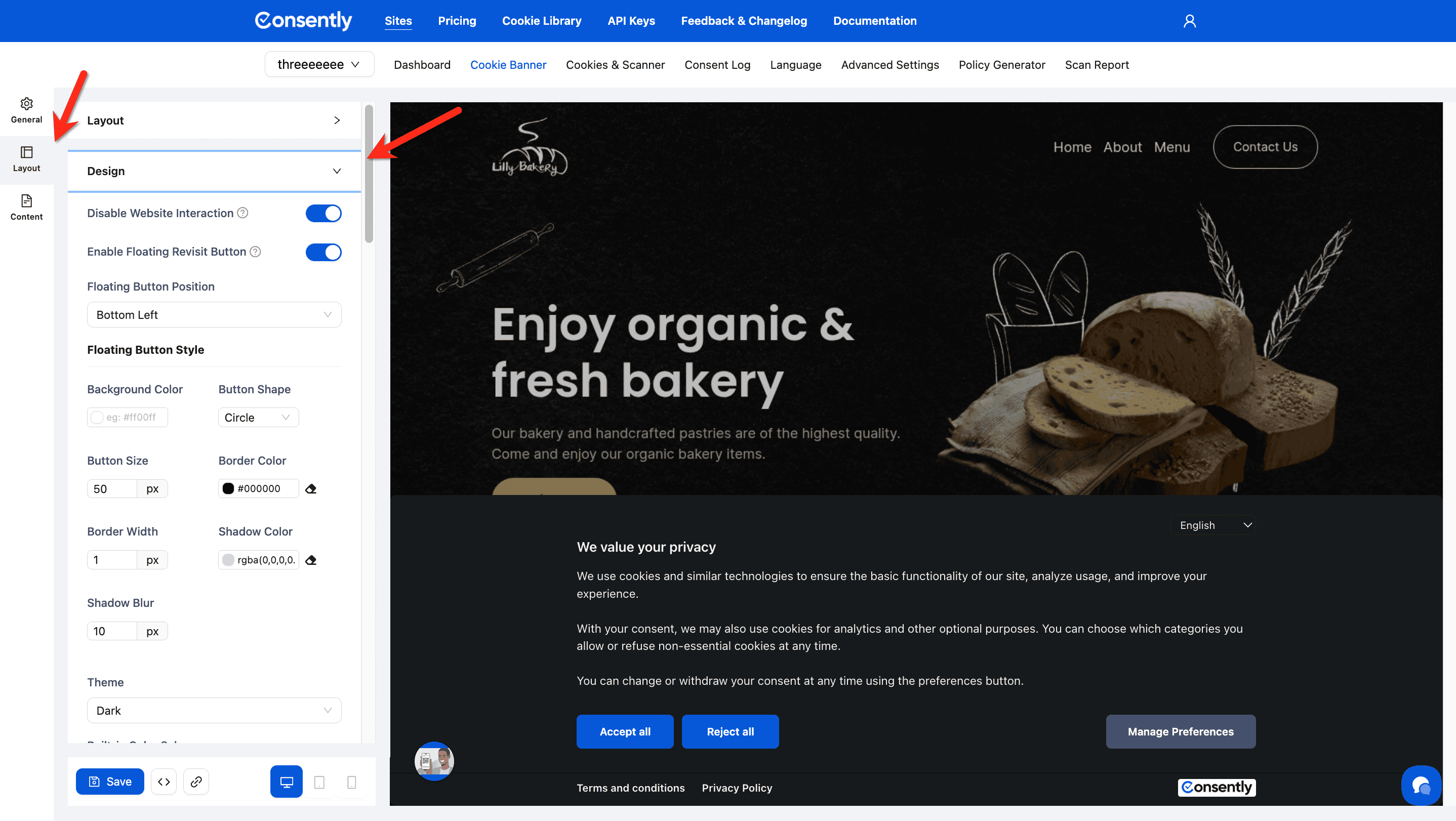
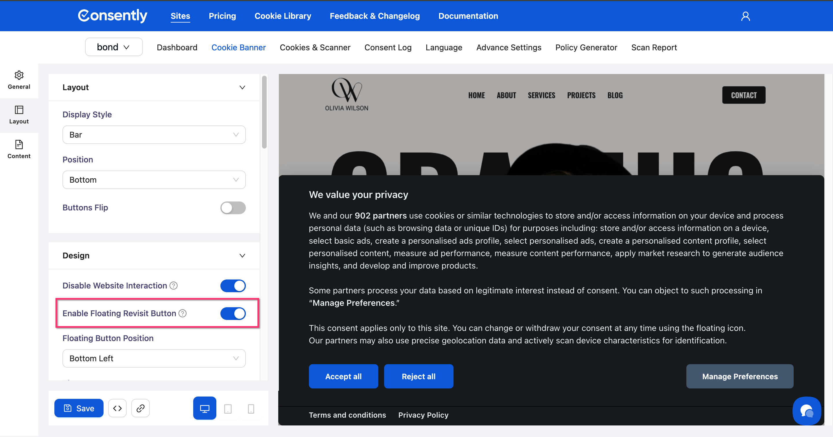
Customizing Floating Revisit Button
The Floating Revisit Button is a persistent icon shown after a visitor accepts or rejects the consent banner. It allows them to reopen the Preference Center anytime to modify or withdraw consent. You can customize its icon, position, and toggle it on or off.
Step 1: Open the Cookie Banner editor
Navigate to your site dashboard and click Cookie Banner in the top navigation.
Step 2: Go to the Layout tab
Click the Layout icon in the left sidebar.
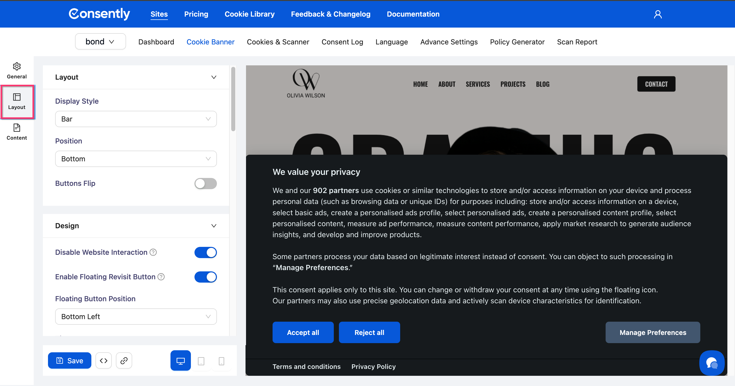
Step 3: Enable the Floating Revisit Button
Scroll to the Design section and toggle Enable Floating Revisit Button on.
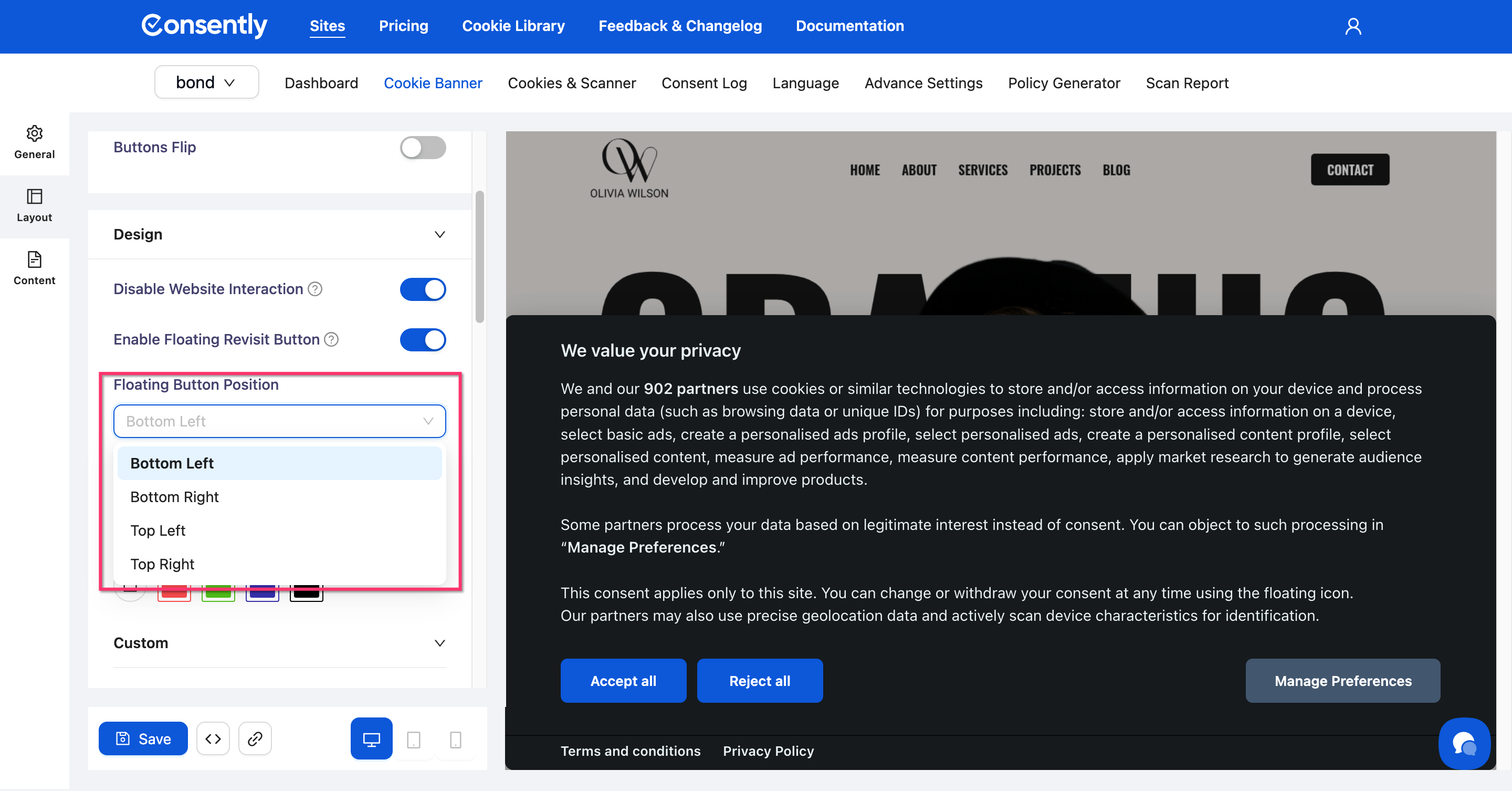
Step 4: Set the button position
Click the Floating Button Position dropdown and choose where the button appears on the page: Bottom Left, Bottom Right, Top Left, or Top Right.
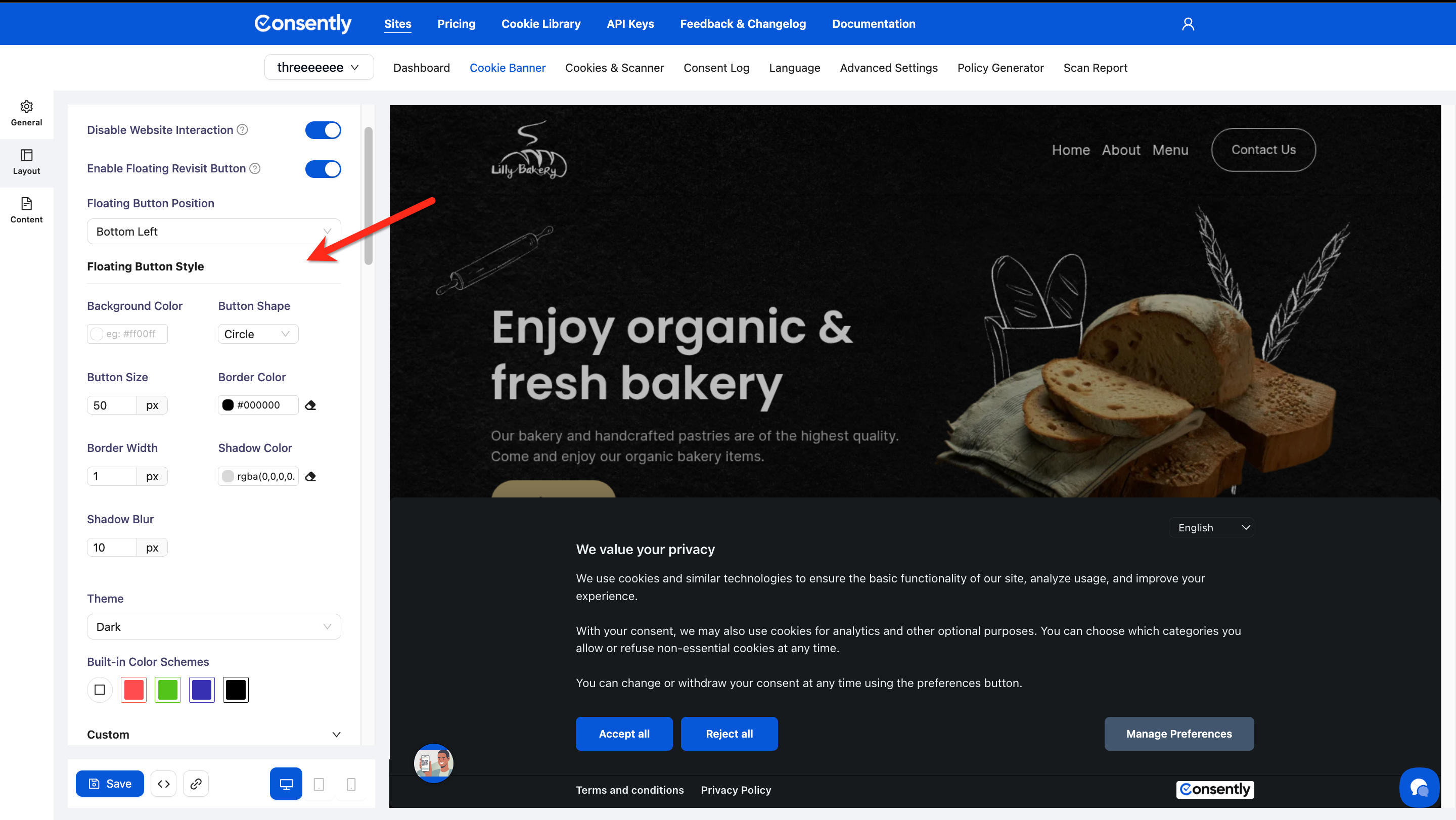
Step 5: Style the floating button
Scroll to Floating Button Style and configure each property:
Background Color — Button background (hex or color picker)
Button Shape — Choose Circle or another shape from the dropdown
Button Size — Set the diameter in pixels (default: 50px)
Border Color — Button outline color
Border Width — Outline thickness in pixels (default: 1px)
Shadow Color — Drop shadow color (supports rgba for transparency)
Shadow Blur — Shadow softness in pixels (default: 10px)
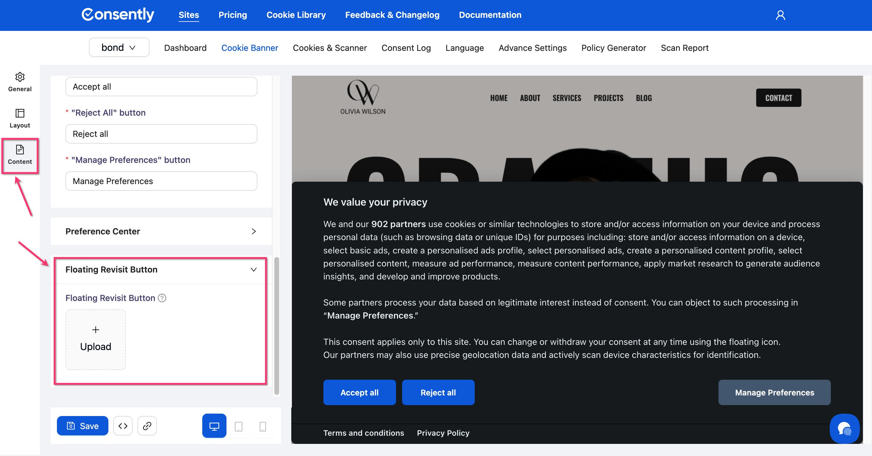
Step 6: Upload a custom icon
Click the Content icon in the left sidebar, then scroll to the Floating Revisit Button section. Click Upload to add your custom icon image.
💡 Tip: These steps are optional. If you don’t customize it, the floating revisit button will be enabled by default and displayed with the default icon in the bottom-left corner.
Step 6: Save your changes
Click Save at the bottom of the editor to apply the configuration.
⚠️ Important: Changes go live on your website immediately when saved. There is no draft mode for the banner.
Done!
✅ Success indicator: Reload your website and look for the floating icon in the corner position you selected.
Styling Buttons
Each button has six customizable properties. Configure colors for all three banner buttons: Accept All, Reject All, and Manage Preferences.
Step 1: Expand the button section
Scroll to the button you want to style (e.g., "Accept All" Button).
Step 2: Set button colors
Adjust each property using the color picker:
Color — Button text color (normal state)
Hover Color — Button text color when the cursor hovers
Background — Button background color (normal state)
Hover Background — Button background color when the cursor hovers
Border Color — Button outline color (normal state)
Hover Border Color — Button outline color when the cursor hovers
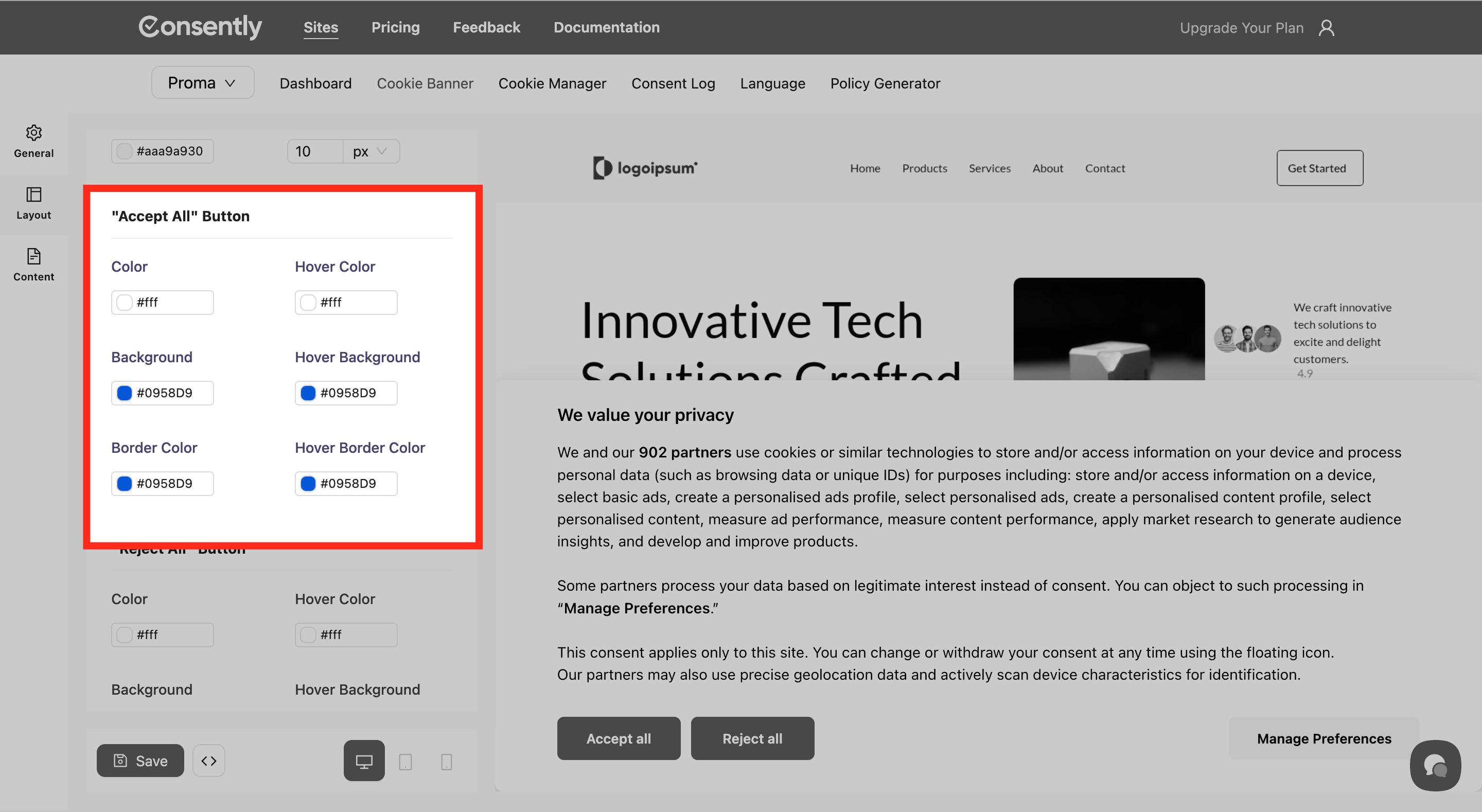
Step 3: Repeat for other buttons
Apply the same customization process to Reject All and Manage Preferences buttons.
⚠️ Important: Ensure sufficient color contrast between text and backgrounds for accessibility. Light text requires dark backgrounds, and vice versa.
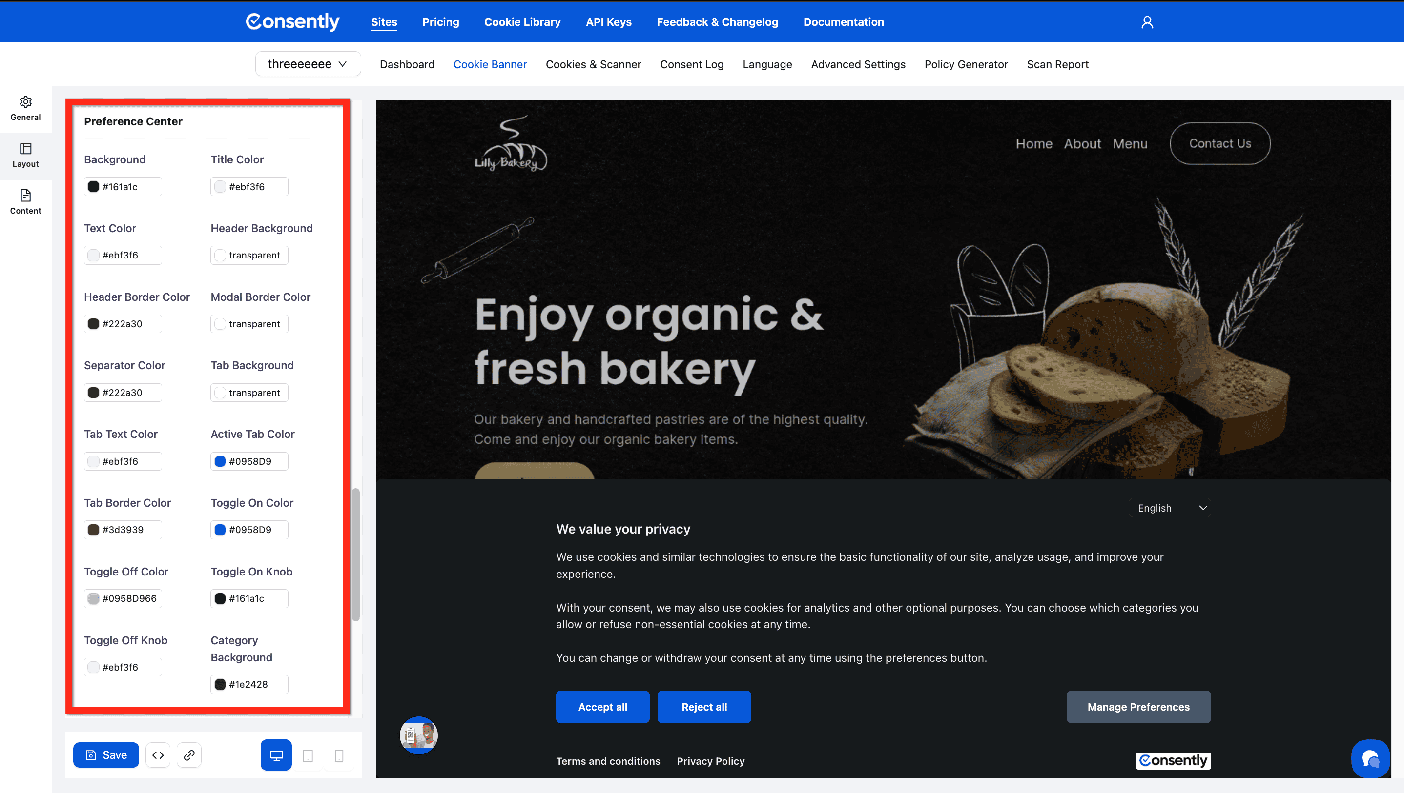
Customizing Preference Center Colors
The preference center is the detailed cookie settings modal that visitors open when they click Manage Preferences. Its colors are configured separately under the Layout tab.
Step 1: Open the Layout tab
Click the Layout icon in the left sidebar (if not already selected).
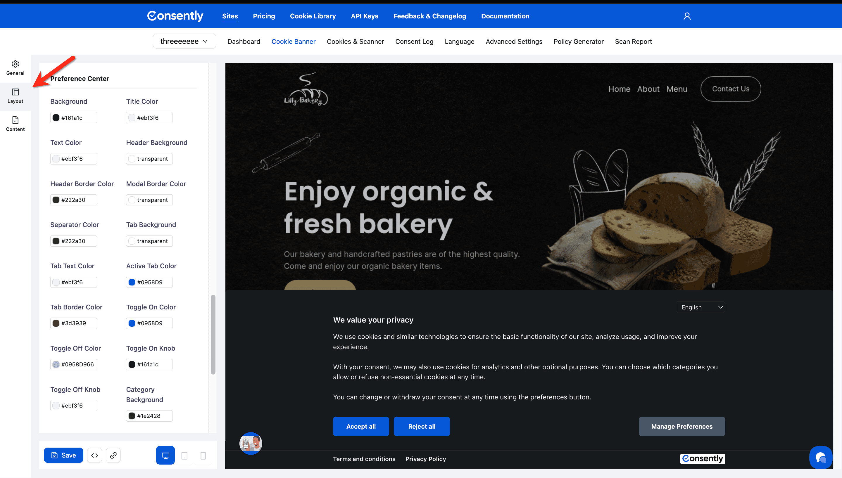
Step 2: Configure preference center colors
Scroll to the Preference Center section and set each color using the color pickers:
Structure:
Background — Main modal background
Header Background — Header area background
Modal Border Color — Outer border of the modal
Text:
Title Color — Modal title text
Text Color — Body text
Header Border Color — Divider below the header
Tabs:
Tab Background — Background of category tab buttons
Tab Text Color — Text inside tab buttons
Active Tab Color — Highlight color for the selected tab
Tab Border Color — Border around tab buttons
Separators:
Separator Color — Lines between sections
Toggles:
Toggle On Color — Background of an enabled toggle
Toggle Off Color — Background of a disabled toggle
Toggle On Knob — Knob color when toggle is on
Toggle Off Knob — Knob color when toggle is off
Categories:
Category Background — Background of each cookie category row
Category Border — Border around category rows
Category Hover Bg — Background color when hovering a category
Category Hover Border — Border color when hovering a category
Checkbox Color — Color of selected checkboxes
Close Button:
Background — Background color of the close (X) button
Icon Color — Color of the close icon itself
Border Color — Border around the close button
Done!
✅ Success indicator: Open the preference center in the live preview to confirm all colors render correctly across tabs and toggle states.
Testing Your Design
Step 1: Use the live preview
Changes appear instantly in the Preview panel on the right side of the screen.
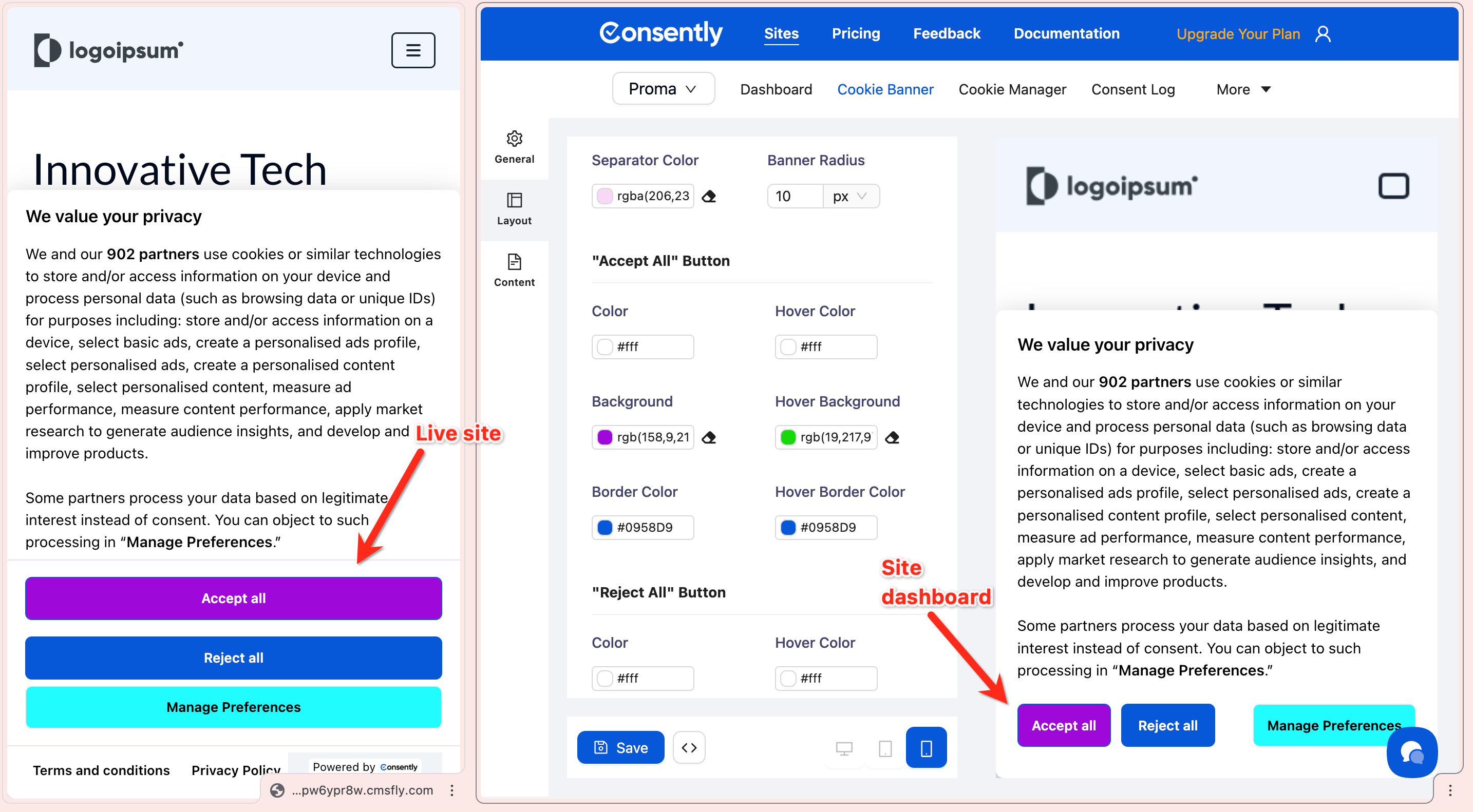
Step 2: Test on multiple devices
Click the device icons (desktop, tablet, mobile) at the top of the preview panel to see how your design appears across screen sizes.

Done!
Your design is ready to save and publish.
✅ Success indicator: The banner in the preview matches your brand colors and remains readable on all device sizes.
What's Next
Now that you've designed your banner, you should:
Troubleshooting
Text is hard to read
Why this happens: Insufficient contrast between text and background colors.
Solution:
Use dark text on light backgrounds, or light text on dark backgrounds
Test readability by viewing the banner preview at different zoom levels
Use an online contrast checker tool to verify accessibility standards
Changes aren't visible in the preview
Solution: Click the Save button at the bottom of the left sidebar. The preview updates automatically after saving.
I want to reset to the default colors
Solution: Click one of the built-in color themes (White, Red, Green, Blue, Black) to restore preset colors, then customize from there.